

Wolf & Shepherd
Wolf & Shepherd is a men’s shoe company, with the goal to combine luxury footwear design with the comfort of athletic shoes. The company was recognized by Business Insider, Men’s GQ, Sport’s Illustrated, the Wall Street Journal, and is leading the way in the men’s shoe industry. In 2019, their small team was beginning to rapidly expand and needed a website that could keep up. The strength of the company is their ability to use athletic shoe construction within a luxury shoe design, and they wanted an effective way to communicate that on their e-commerce website.
My goal, partnered with a developer, was to draw users to the website through a revised email flow, and to make finding their desired product easier through a revised navigation menu. This case study will explore the email campaign user flow designs and the redesign of the navigation menu.
Responsibilities
User Research Analysis
Information Architecture
UI Design
Branding Design
Visual Design
Photography
Photo Editing and Retouching
Tools
Google Analytics
Mailchimp
Shopify
Adobe XD
Adobe Photoshop
Adobe Illustrator
Adobe InDesign
Timeline
6 months
Q1 and Q2, 2019
Final Prototype


Part 1: Drawing in the User
Email Flows and Campaign Redesigns
The ultimate goal of any business is to draw brand awareness and bring more users to their website. Before optimizing our website, the Wolf & Shepherd team needed to draw more eyes to its pages, through strategic email user flow revisions. To achieve this, we would need a combination of user understanding, marketing strategy, and beautiful design.
Partnered with the marketing team, we dove into Wolf & Shepherd’s Mailchimp analytics to determine which email campaigns received the highest ROI, pinpointed what steps received the highest response rate, and reached out to loyal users for feedback.
We found that a large percentage of revenue was generated from automated emails, which created a window of opportunity to increase passive revenue. Exact details are not disclosed for privacy of the company. We revised the automated abandoned cart email flow, and later focused on appealing to different tiers within our marketing funnel.

Automated Email User Flows
Automated email user flows are triggered when users interact with specific pages on a website. Our Abandoned Cart automated email flow was activated when users added an item to their shopping cart, but did not purchase it within 24 hours.
We discovered that users would often discover our products through Facebook or Instagram ads while browsing on mobile. They would often abandon their shopping carts while on the go and forget about the purchase they intended to make. By designing a strategic abandon cart email user flow, we could ensure users would be reminded of the luxury shoes they craved.
We discovered this automated email flow generated the highest revenue, and we decided to expand it further.
Problem
Users need more automated abandoned cart reminders, because they often purchase products they forgot in their shopping carts.
Solution
By designing a three-part abandoned cart user flow, we will create more opportunities for users to purchase items they are interested in, and increase our revenue. We will know this to be true when we receive an increased profit as a result from this change.
Our original abandoned cart email flow involved one follow up, after 24 hours of an abandoned cart. With the following user flow, a user would be reminded of their shopping cart three times, allowing them additional follow-up opportunities to secure their purchase. The revised flow is shown below.
The final abandoned cart emails are shown below, labeled according to their triggers within the email flow from above.
Email Campaigns
After successfully implementing our abandoned cart email flows, we hypothesized that the increase in customer follow-ups helped keep our company at front of mind. Because of this, we doubled the frequency of our marketing emails, from weekly to twice-weekly. Our twice-weekly email campaigns consisted of topics that were scheduled based on their relevancy in the marketing funnel. An example of each marketing funnel email can be viewed below:
We also focused on providing visually captivating content. As a photo editor, I collaborated with the photographer to create eye-catching imagery for our marketing campaigns. Every marketing tier contained custom visual language. Our evergreen emails, aimed to draw new users, focused on emulating visual trends used by large brands, so users could understand our role in the market. Our narrow funnel for loyal users focused on creating the feeling of a journal, with script fonts and intricate stories, so users could engage with the personality behind the brand.
What we Learned
We found that an increase in email frequency, especially with automated email flows, led to an increase in user awareness for our brand, as well as an increase in product purchases.
We discovered that users enjoyed learning about our brand’s story, and by catering user experiences within each marketing funnel, we were able to strategically form a more personal relationship with users and acquire more loyal customers.

With additional time, I would have designed additional automated email flows, to further increase user engagement. We could test email frequency further, to refine ideal email frequency rates for the highest CTR and test new features within each customer tier. Finally, we could do further user testing with emails, to increase how much users enjoy them. Which brings us to: the website.

Part 2: Guiding the User
Refining Navigation
After gaining an increase in page views due to our email revisions, we began revising the desktop and mobile website. Although many revisions were created, I will walk you through one of the most impactful: refining the website navigation. We found that many users needed clarity to find their desired products. Our navigation bar lacked filters and products required in-depth searches. An example of the original website is shown below.

Partnered with a developer, we restructured the navigation architecture and designed an easy method to contact support. Before designing all of these updates, we needed to understand what the user needed.
Research
User Feedback
Our customer service team reported that users expressed overwhelm from the amount of information about products, and confusion on how to locate what they needed. The original navigation bar included a photo of each product profile, but products that were hybrids were difficult to find. Users were unable to filter products by features that desired, such as color, material, or style. Many users were also unfamiliar with industry terms related to shoes, and needed simple language that they could understand. Some of their sentiments are reflected below:

Task Analysis
We conducted a task analysis of users to locate which steps they took to find a product. In this example, our user Cody was searching for shoes in the color “Maple”. We tracked each step that he took to complete this task, as labeled below.
Our findings indicated that users took many steps to achieve locating or browsing for specific products. The number and quality of these tasks could be refined, or help should be easily accessible if they could not.

Competitive and Comparative Analysis
We needed a navigation bar that would eliminate task steps and allow for filtered searches. Before finalizing which filters we would use within our navigation, we referred to other big players in the industry. I created a feature inventory and a strengths and weaknesses assessment, of both direct and indirect competitors. Their data can be viewed below:


From the research, we observed that having the more filters was not related to a website’s success. However, having the relevant filters and easily accessible help was relevant to a website’s usability and success. I created the following problem and solution statements:
Problem
Our navigation bar should be revised to easily filter and direct to any product, because users currently need to take many steps to locate some products.
Solution
We will revise the navigation architecture and language of the website menu, and add filters for users to search products. These changes will enhance the ease of product locating, and encourage more users to find products they desire. We will know this to be true when we have a 5% increase in sales, as well as similar user feedback.
Reconstructing the Site Map
In order to understand how users could locate products faster, we had to understand their way of thinking and language they understood. I performed an open card sort activity with fifteen users, to observe their mental model of our products. I gathered users with both industry knowledge and basic knowledge of our product, and asked them to sort and title groups instinctually. Our original site map can be viewed below, along with the revised map I created after the exercise.


Ideating
Sketching and Wireframing
I sketched the revised navigation bar, and turned the sketch into a basic wireframe. We decided to go with a stacked layout, keep the images for each shoe style, and iterate once more products were added. We turned these into wireframes, and later a basic mockup for the developer to create.


Prototype
The new features included in the final design were product header images, filtered navigation, product subheader navigation, and an active live-chat feature in the lower right-hand corner of the screen. The chat feature eliminated many redundant web pages that could all be accessed there, quickly and immediately.
I created a functional prototype from the existing wireframes, and began to update other visual elements, such as font, colors, and scale. As per the client’s request, iconography within the navigation bar was kept the same.
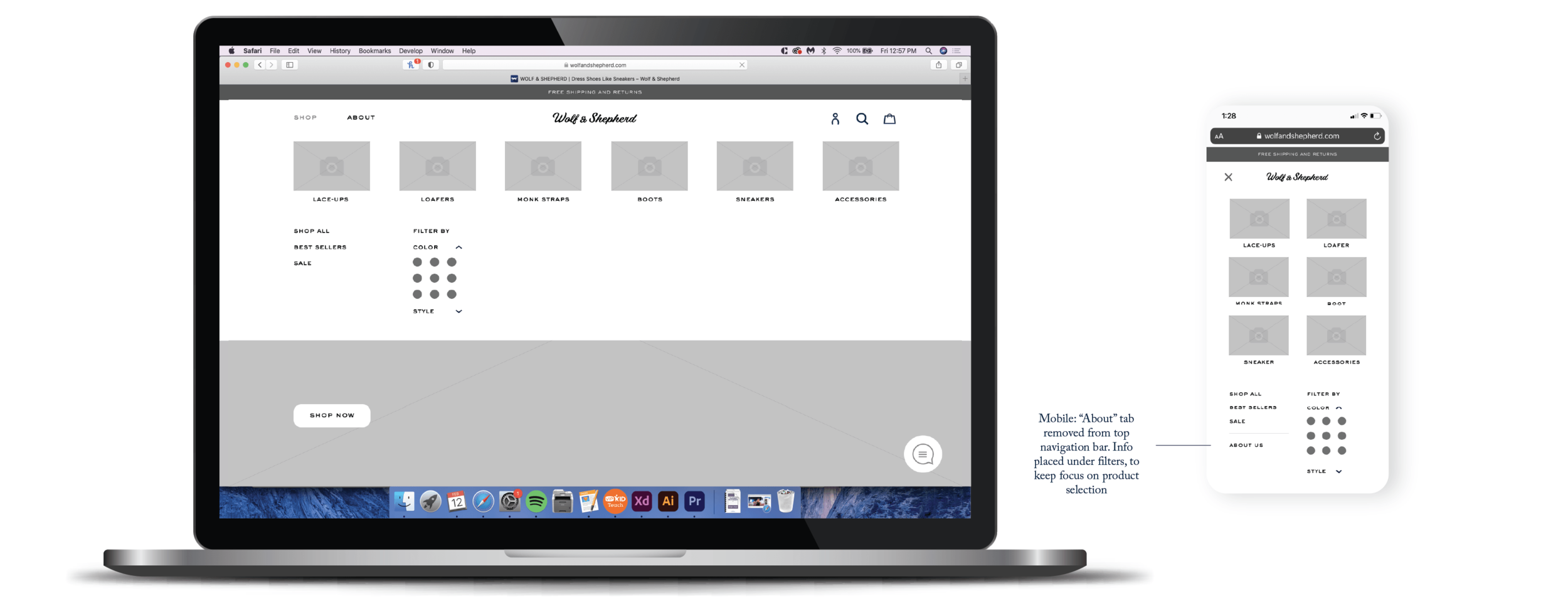
The mockups of the final navigation bar were sent to the developer, who coded and launched the changes. The mobile and desktop navigation bar prototypes are shown below.

To see them for yourself, the live mobile and desktop prototypes are linked below.
Learnings
The changes in the navigation bar powerfully improved website usability and customer satisfaction. Customers were able to locate products more quickly, and the layout provided room for growth as the company was launching more products. The number of tasks our users took to locate products in a specific color was lessened by 70%. Customer feedback indicated that the live-chat feature was helpful, and saved our customer service team time and efficiency.
With more time to build upon this, I would have pursued A/B testing categories of navigation filters and layouts. This update increased customer satisfaction, and laid a solid foundation for other edits that were made across the website.

Part 3: Brand Guidelines
The bread and butter of the brand, moving forward
Towards the end of my time with Wolf & Shepherd, I summarized the design guidelines I had created while working with the team, for future designers to reference. I created a private and public brand guidelines book, each laying out the visual, verbal, and usability languages spoken by the brand. Below is the public-facing brand guidelines book.


