

Evite
Evite is a B2C digital invitation platform that allows users to create, send, and manage online invitations for events. It offers free and premium invitation designs for occasions like birthdays, weddings, baby showers, and corporate events. Guests can RSVP to events online, and hosts can track responses, send reminders, and coordinate event details through the platform.
Our UX team was responsible for designing the company’s desktop and mobile website, along with the Evite iOS app.
Responsibilities
Research Analysis
UX Strategy
Flow Architecture
UX Designs
Prototyping
Interaction Design
UI Design
Team
Data Analyst
Illustrator
Product Manager
Timeline
6 months
October 2023 - March 2024
UX Strategy
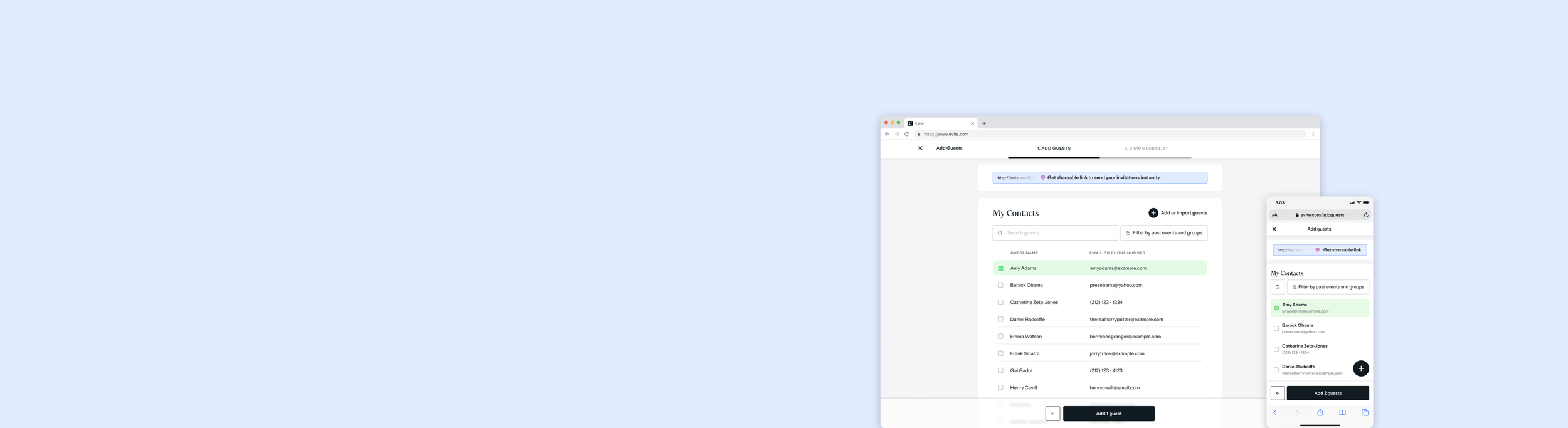
Redesigning the Add Guests Flow
Adding guests is the final step in completing an event invitation. However, data and user feedback revealed that this step had the highest drop-off rate on the platform. Our goal was to increase the number of completed invitations by making this step faster, simpler, and more intuitive—especially on mobile, where most users performed this task.
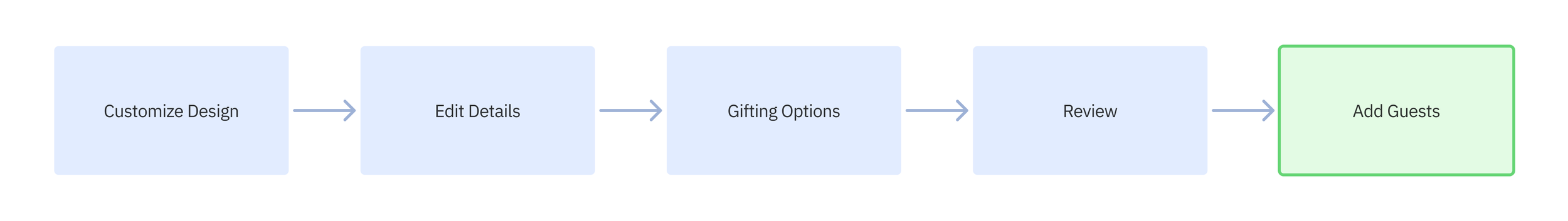
The 5 steps of creating an Evite:
At the time, users were redirected to a separate confirmation page after reviewing their invitation design, in order to allow flexibility on when to add guests. However, we discovered this break in flow caused friction and contributed to high drop-off before guest lists were completed.
Research
Using PlaybookUX, we ran unmoderated usability tests and surveys with 20 users to understand pain points in the current flow. We gained the following insights:
Users were redirected away from the creation flow after reviewing their invitation, which led many to abandon the Add Guests step entirely
New users were unsure how to manually add guests and struggled to find the right entry point
Multiple methods of adding guests contributed to overwhelm and confusion
Returning users wanted access to previous guest lists to reduce cognitive effort
Lack of clear confirmation after guests were added or invitations were sent led to confusion and weakened user trust

UX Strategy
From our research, we identified several opportunities to improve the experience for both new and returning users:
Guide users directly to the add guests step after reviewing their invitation, rather than breaking the flow
Simplify the entry screen to reduce decision fatigue and improve improve initial navigation
Offer clear step-by-step guidance for new users
Surface previous guests for returning users, to reduce time and mental effort
Ensure clear confirmation states when guests are added and invitations are sent
Design with a mobile-first approach to ensure consistency and ease of use across devices
Before
Final Design
Embraced a mobile-first approach, simplifying controls and aligning desktop patterns for consistency
New users received clear onboarding with simplified, step-by-step screens and fewer entry choices
Returning users gained power features: filtering by past events, searching previous guests, and selecting guests from previous lists, to reduce effort
Simplified the premium upsell modal to reduce friction and better integrate within the flow
Improved visual hierarchy to guide users toward common actions like manually adding or selecting previous guests
Introduced a confirmation animation to reinforce progress and create a moment of delight
New Users Revised Flow
Returning Users Revised Flow
Outcome and Impact
Because I left Evite before this feature was launched and tested, the full impact and metrics were not available to me. However, preliminary usability testing showed significant improvements in perceived clarity, user confidence, and time spent adding guests. Stakeholders responded positively to the strategy and final designs, noting a more "on-brand” and “delightful" experience.
Even without final performance data, this redesign established a scalable foundation for future improvements and repositioned the Add Guests flow as a more intuitive, user-centered experience.
If I had stayed, I would have tracked:
Conversion rates from invitation creation to guest list completion
Time to complete guest list
Drop-off rate changes for the Add Guests step
Premium upsell click-throughs
Reflection
This project reinforced the value of:
Designing mobile-first to force clarity and prioritize essentials
Eliminating unnecessary choices to reduce user friction
Visual validation and UX motion as tools to reward progress and reduce uncertainty

Interaction Design
Increasing Revenue through Engagement
Standing out in a crowd of party apps requires a key ingredient: fun! In order to broaden our target audience, increase engagement, and increase premium upsells, our team created engaging experienced through enhanced interactions.
A few of my interactive enhancements and their benefits are shown below.
Interactive Premium Upsell
In Spring 2024, Evite launched a new feature: matching invitation sets, which included themed envelopes, backgrounds, and digital stickers, all available through a premium upgrade. Our primary business goal was to promote this matching set upsell within the invitation design flow.
Stakeholders required the upsell upgrade to appear at the start of the invitation design flow. However, placing upsells early in the process often leads to user frustration and drop-off, especially when presented as interruptive modals.
My Role and Approach
As the interaction designer on this initiative, I was responsible for:
Mitigating risk of user frustration while honoring stakeholder placement requirements
Designing a visually engaging upsell that communicated value early, without derailing the creative process
Collaborating with product, engineering, and art teams to align on brand tone, animation, and layout
To address concerns around traditional modal fatigue, I proposed a side-panel animation that subtly demonstrated the before-and-after effect of a matching set—while keeping the invitation canvas fully visible. This allowed the matching invitation set to take center stage, while offering a clear path to upgrade.
Impact
Although we were unable to test the design pre-launch due to timeline constraints, we conducted post-launch analysis, which proved to be very successful. It showed:
Significant increase in premium upsells on this screen
Improved user satisfaction compared to previous upsell implementations
Internal teams reported fewer complaints related to upgrade interruptions
This outcome reinforced that thoughtful interaction design, even under constraints, can balance business goals with user needs and elevate product perception.
iOS Ratings Prompt
App ratings often skew low—not because users dislike the product, but because they only rate it when something goes wrong. To improve Evite’s app store presence, I designed a custom iOS ratings prompt that appeared at key moments of user satisfaction, encouraging positive reviews without disrupting the experience.
At the time, the app’s rating was gradually declining, and the app had no proactive mechanism to prompt happy users to leave a review.
My Role and Approach
Identified moments of peak user satisfaction
Designed a lightweight animated ratings prompt to match the app’s fun, playful tone
Ensured the prompt felt inviting, not disruptive, to avoid breaking user flow or momentum
Collaborated with product and engineering to implement the Apple-native API in a way that aligned with our brand experience
Impact
+0.2 increase in App Store rating within 3 months of launch
Positive qualitative feedback from users and internal stakeholders
No measurable increase in app exits or task abandonment at the point of prompt
Opened the door for future trigger-based feedback systems tied to user satisfaction

UI Design
Graduation 2024
Evite regularly refreshes its homepage and landing pages to align with the current season—Christmas, Valentine’s Day, New Year's, and many more. For Graduation 2024, I led the design of a new UI across our desktop homepage, with the goal of delivering a unique, brand-forward experience that differentiated us from our competition.
Most online graduation invitations follow a safe visual formula: minimal white and gold designs, serif fonts, and polished formality. To stand out and better engage our Gen Z audience, we set out to create a UI that felt:
Bold, celebratory, and unique
Three-dimensional, echoing the textures of our digital invitation features (stickers, backgrounds, etc.)
Modern and youthful, while still aligned with our brand identity
My Role
I led the design vision and execution of the seasonal UI, including the homepage, landing pages, and featured visuals. I collaborated with an illustrator, who contributed custom textures and stickers. Together, we brainstormed, iterated, and refined multiple concepts before aligning on a final direction.
Business Goals
Develop a visually unique homepage experience for Graduation season
Promote matching invitation sets
Highlight interactive add-ons, such as stickers and backgrounds
Increase Gen Z user engagement and brand resonance
We explored three distinct UI themes for the season, shown below:
User Testing & Validation
We validated our concepts with unmoderated user tests and surveys on PlaybookUX, focused on:
Visual appeal
Brand alignment
Clarity of messaging
Click-through-rate of desired upsells
Our team selected Option 1: The Cap Toss, as it struck the right balance between brand recognition, uniqueness, and younger generational appeal.
Final Design
The final UI incorporated:
Animated sticker elements tied to our invitation features
A 3D-rendered cap toss to create visual energy and introduce the theme
Prominent, branded CTA blocks guiding users into the design flow
Next Steps
Although I left Evite before launch metrics were available, I had planned to track and optimize the following KPIs to guide future seasonal iterations:
Click-through rates on featured modules (e.g., matching set upsells, graduation invites)
Completion rate of graduation invitations, year over year
Growth in Gen Z engagement (via demographic metrics)
Scroll depth and time on page
Heatmap analysis to ensure users focused where intended